Disclaimer: this post is over a year old and may be outdated. If you find any broken links or outdated information, please leave a comment on the post.
When beginning this project we felt that in order to properly brand a letterpress studio, homage must be paid to the age-old discipline of letterpress printing. Letterpress has a very rich history, and the logo alludes to that history by referencing the union badges that letterpress printers were once a part of. To further supplement the logo’s authenticity, we restricted our type choices to those that physically exist as lead type in the studio’s type collection (we used Alternate Gothic, Clarendon Bold, and Hellenic Wide). Jack Sinclair—the studio’s namesake—was an avid letterpress printer himself and was a major donor of presses and type to the program. His posthumous donation, along with the contributions and donations of many others, has positioned the University of Arizona as proprietors of one of the largest type collections in Arizona.
Jack Sinclair was a friend who always had your back, a man who loved the quirkiness of life, and above all…his own man and a free spirit. He must love the Jack Sinclair Letterpress Studio…all of Atlanta NF ’64 missing you.
Archer Hannah
Established under academia, the studio has an emphasis on education and combining new technology with vintage letterpress machinery; we wanted to convey this notion with the design and production of the various print materials. First, we digitally designed the materials with typefaces that were drawn based on letterforms from the golden age of letterpress. Next, photopolymer plates were created from the designs (the plates were made by Boxcar Press and after use sent back to them for recycling). Finally, the plates were used to print the materials manually with a letterpress.
For the grand opening celebration, the university wanted it to be a fun and lavishly letterpress-filled event. We designed an invitation, commemorative print, bookmarks and a set of coasters. It was a particular challenge to integrate responsible design decisions here, as letterpress commonly uses rubber-based or oil-based inks and is printed on thick paper typically made from cotton (conventionally grown cotton uses egregious amounts of insecticides and pesticides). The goal was to create responsibly-produced objects while maintaining the beauty and aesthetic qualities of letterpress. We did some research and it seemed that vegetable-based letterpress inks weren’t available (or up to standard) quite yet. The search for a responsibly-produced paper, however, we knew would be much more successful and resulted in settling on Mohawk’s Loop line. With the exception of the coasters, everything was printed on Smooth Ivory, a 100% recycled, 160lb double thick cover.
Overall the paper served our needs well, but it presented a few problems and in retrospect we probably would have spec’d a different paper. To achieve the much sought after “deep impression” that we were aiming for, the ideal paper is soft and spongy. The “Loop Smooth” was very rigid, and had a very fine tooth. We’ve since used the “Antique Vellum” line (also Mohawk Loop) for letterpress which is a much more suitable choice for a deep impression, and also has a very distinct tooth we’re quite fond of. Also, the rigid double thick cover presented another problem: while printing the invitations, the duplexed sheet would sometimes split, resulting in some unnecessary waste that our printer speculated was due to the rigidity of the sheet. We contacted Mohawk and they quickly replaced our paper loss.
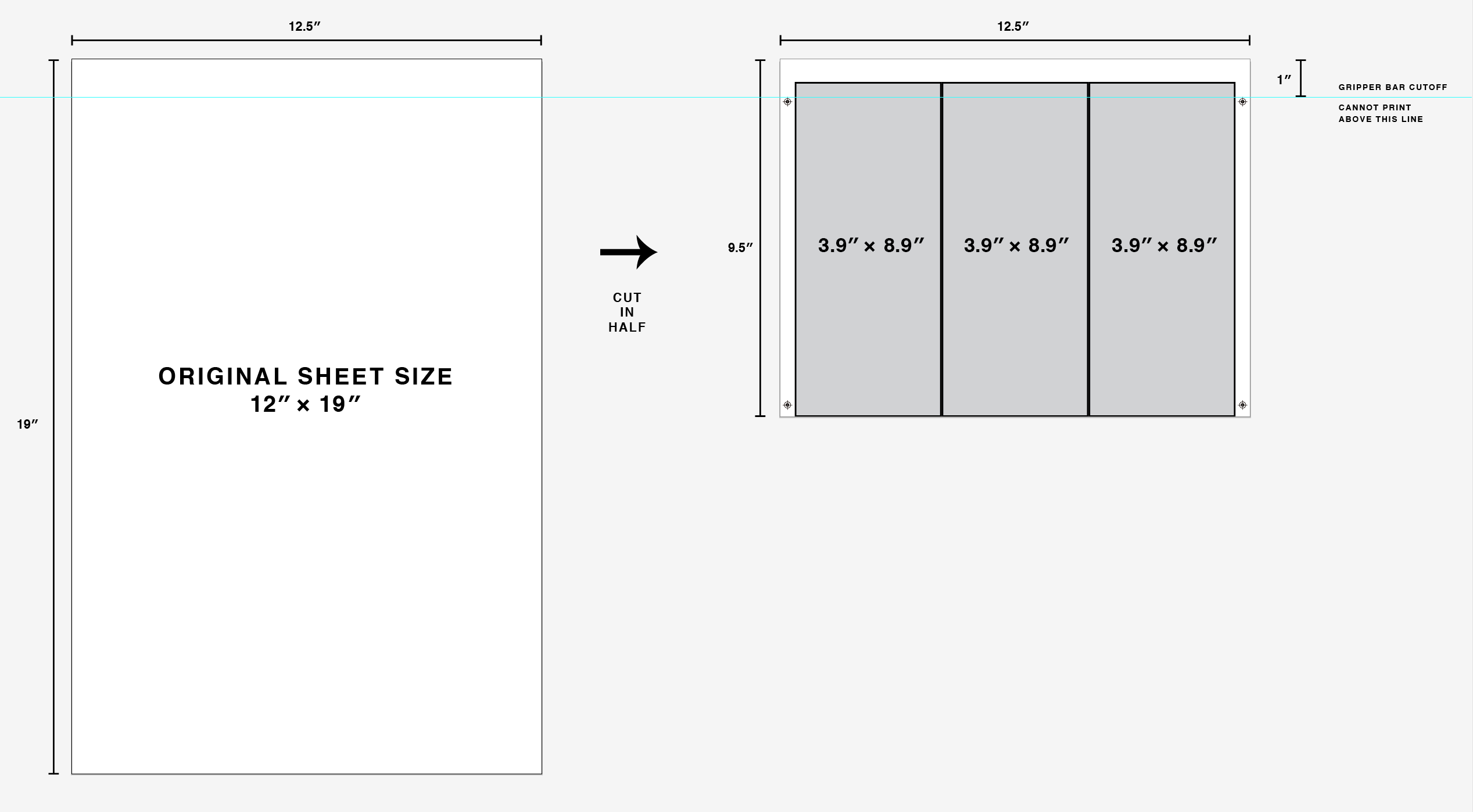
Invite layout plan
The invitation was printed in a fairly large quantity and in order to minimize paper use we designed it in a postcard format that could be mailed without the use of an envelope. We worked within the USPS postal regulations to develop a unique size that would stand out from other mailpieces. Due to the large quantity and technical expertise required, we worked with expert Jim Irwin of Letterpress Finesse to print the invitation. He did an amazing job and absolutely nailed the registration. The rest of the materials were printed in-house at the Jack Sinclair Letterpress Studio with the help of design student and printer extraordinaire Rob Wilson.
To make use of the paper trimmings (waste) from the art print, we designed bookmarks using the lead type in the shop. This not only negated the need for a photopolymer plate but also added to the variety of the print materials produced for the event: letterpress printing using new technologies and letterpress printing using traditional methods.
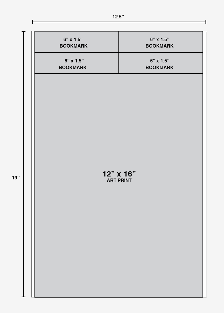
Art print and bookmark layout plan
The coasters required a super thick paper and we had a lot of trouble finding a responsible paper that would be suitable. Not every battle can be won, and in the end we settled on something less than satisfactory. That aside, overall we were very happy with the way the project went and learned a lot along the way. For more photos of the work, view our project page.
The event was a great success, and both the invite and event memorabilia were very well received. If you have any feedback, questions or suggestions, please leave them in the comments below.